Choropleth Maps
Overview:
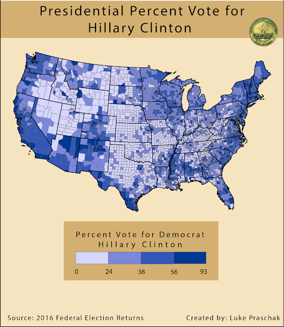
The second project in Cartographic Design was to create an effective choropleth map. In order to really grab the attention of our audience we used the 2016 presidential election results. Some rules to keep in mind when designing an effective choropleth map is picking colors that best fit what is being explained. In this case I have democratic and republican vote. Blue matches the democrat party color and red matches republican. Another important rule is to choose the appropriate number of classes. Too many classes can lose the viewer in trying to understand differences. In the two maps below I chose to use 4 classes to display the percent vote because I believe each color has enough distinction to show the viewer differences between counties. After color and classes are established, cleaning up the numbers being displayed is next. Numbers can sometimes includes long decimals and the best thing to do is just to eliminate the decimals. To finish the final products, I brought each map into Adobe Illustrator where I was able to create a clear title and legend. Lastly I added background colors that was effectively bring light to the map.


Comments
Post a Comment